New Book Cover Design Art and Title
Hey there folks,
This is part two about the relaunch of the first book of The Incredible Adventures of Merri Berri Blue series. Yes, it’s a series, so there’ll be a second book coming out soon!
Anyways, the first book has gone over some changes…both the cover artwork and the title are brand new, along with a new Introduction and bonus section on the Sparks of Spirit.
The New title of the book is similar, but a bit different…
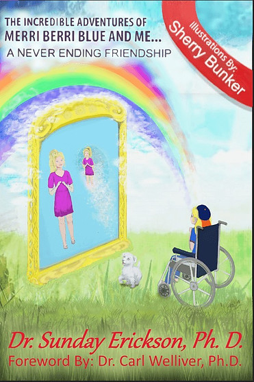
The Incredible Adventures of Merri Berri Blue and Me – A Never Ending Friendship
The Process of Creating a Book Cover
The reason for the changes, I believe I explained in the first post, which you can read here, Drawing & Sketching Book Cover Artwork for The Incredible Adventures of Merri Berri Blue.
It took quite a bit of thought and discussion between the members of our creative team consisting of the author, Sunday Erickson, Ph.D., author and mentor, Carl Welliver, Ph.D. and I, as we went through many ideas, and probably threw out about half of them along the way, lol.
Rough Images – Building up the Cover Artwork
Well, here we go…I thought I’d share a bit of that process of what it takes to create a book cover and show you what it looked liked as it progressed along.
Good thing I’m finally starting to remember to save pictures right? LOL…of course it’s much easier since I used digital programs to do the cover artwork. Much easier than trying to remember to stop and take picture of a drawing or painting!
Although I did have some dumb moments like forgetting to save it often…and, ended up having to redo things a few times since whatever progress I had just done, I lost when the computer decided to shut down.
Anyways, here’s the progress of the new cover:
Merri Berri Blue Joins Lucy in the Mirror
Merri Berri Blue is Lucy’s spirit guide, or spark of spirit, in the story…

Adding Color to the Book Cover


A Few More Changes
Problems with Lucy’s head…
One thing that threw me off for a bit was Lucy’s darn head! I couldn’t seem to get it quite right for the life of me…she kept looking a bit too old, so I ended up changing her face a bit. I had kept trying to fix it where I thought it wasn’t right, but that didn’t work…I kept doing the same thing over again…
So, I thought I’d do some head/face stretching and contorting in Krita, which is quite awesome art software…and free to download! Usually I use the program called Artrage Lite, but since the version I have doesn’t have that feature I went over to Krita.
Anyways, that’s a story for another day, but I’ll post more about these two programs here in the future…
Now, on to Lucy’s Head & Face Stretches…and adding some color!
Okay, these are kinda messy looking but, it’s all in the process, lol.


Very Frustrating, to say the least!
But, realizing it might be best to just start over with a new face altogether…finally Lucy’s head is looking like it should, a young girl, about 10 years old or so…
Image of Lucy with her new head added on, next to mirror and Tutu her little dog…

I should have just done that in the first place! It went just fine after erasing Lucy’s face and starting over with it, I was able to add her new face in just like I’d been trying for so many times it was ridiculous…
So, when all else fails…if you’re an artist that is…just start over instead of beating your head on the wall! Or, well, stretching and contorting it this way and that, as I did with Lucy’s LOL!
Although I have to admit, it was a bit fun fooling with that in the Krita art software…
maybe I’ll have to stretch and squish someones else’s head in there sometime…
Just Kidding…sorta!
Adding the Background
So, now what? What about a background right?
Well, that went through many changes…but we finally decided on one with grass and sky…
The New Background Added Below
Adding More Color to the Book Cover
Wanting to add more color, we decided on adding a rainbow as well. That took awhile getting a darn rainbow in, can’t believe how squiggly it looked at first, lol!
Unfortunately, I must not have saved that first strange and squiggly looking rainbow to show you. But, believe me, it looked like it wasn’t quite in the right place, plus the curve or bend of the rainbow just was NOT right. It looked very unnatural as it was in the beginning.
Realizing that, I had to move the whole thing over a bit and bend it a bit more to get it looking like a rainbow should…haha, what a process!…but below is what it finally came to be…a rainbow!

A Few Final Touchups to the Cover
Well, that rainbow by itself just didn’t look quite right at first,
But, once it was done, I thought it looked much better…plus, a few clouds in there as an added touch…just to pull the whole image in together…plus, I love painting clouds! Even if it is using a digital program, it’s still a lot of fun!

Final Image of the New Cover Design!
What? you thought that last image was it?
Nope, still a few little tweaks to it, gotta have it looking as perfect as possible….
Now, here’s the final image…Finally!
Anyways, folks, that’s it! So now there are two versions of the first book out there….the second one, which is the one shown above, has a new foreward included by Dr. Carl Welliver, Ph.D.
You can find both versions of the first book of the series of The Incredible Adventures of Merri Berri Blue and Me on Amazon:
The original version is titled The Incredible Adventures of Merri Berri Blue; Tutu Much
This updated version now sports a new title, The Incredible Adventures of Merri Berri Blue and Me; A Never Ending Friendship.
Below are images of both book covers side by side to compare:
What a big difference, hey?
So, if you want to order either one you still can…I’ll add the links to each one below or you can just click the above images as well to find it over on Amazon.
Coming Soon…
Book two of the Incredible Adventures of Merri Berri Blue and Me series!
Thanks for reading! I appreciate it, and if you’d like to share this post with your friends, please do so!
Our team at Merri Berri Blue Publishing would all appreciate any help in getting word of the book series out to more readers!


